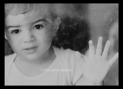
 The tone of this photo was created by mistake and I thought I'd share. This is Alexi looking through the glass of our dirty screen door (it has since been cleaned.) I converted it to black and white and saw that the copyright didn't really show up. So I went to the type layer and clicked the paintbucket to change the color to black - but much to my surprise the entire photo(except for the copyright) was flooded with black but at 45% opacity. It looked pretty cool and intense and I lowered the opacity a bit more and left it at that.
 Here is the original, which I still like - maybe if I get them printed out then I can decide which is better. Any opinions out there?
Today's post is definately for the Photoshop lovers out there.

1 comment:
Hi, Thanks for commenting on my blog! I like the bottom one better, and I do like the effect! I do things on accident all the time in photoshop!
Post a Comment